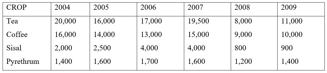
The table below shows the value of cash crops produced in Kenya over a period of six years in (‘000) Kenya shillings.
i) Using the data provided above draw a comparative line graph to represent this information
ii) Which year was the total value of the cash crops the highest? How much was it?
iii) Which year experienced the greatest slump in total production of cash crop and why?
iv) Give four merits of using comparative line graph to represent data
0 Comments
KCSE Geography Paper 2 2001 Section A Question 1. The bar graphs show the value of trade between Kenya and other countries for the year 1995,1996 and 1997. Use it to answer question (a).  SOURCE OF DATA: STATISTICAL ABSTRACT ( K) 1998 a) (i) Name the type of bar shown above
(ii) Calculate the cumulative differences in value between Kenya and other countries
(b) Give two reasons why there is an imbalance of trade between Kenya and other countries
KCSE Geography Paper 2 2000 Section B Question 6 with Answers.The table below shows items exported from countries A and B. Use it to answer questions (a), (b, and (c)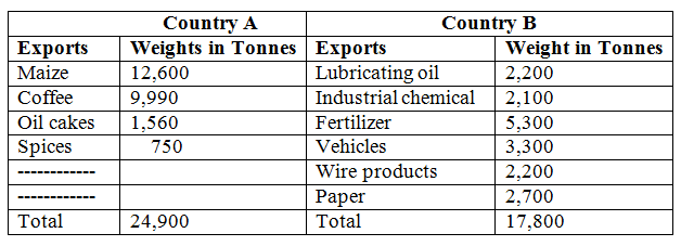
(a) (i) Name the main export item of each country
(ii) Calculate the percentage of the export item with the least tonnage in each country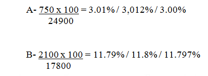
The table below shows the value of Kenyans imports and exports in 1999.Use it to answer questions(a)26/2/2021 KCSE Geography Paper 2 2003 Section B Question 6. The table below shows the value of Kenyans imports and exports in 1999.Use it to answer questions(a) 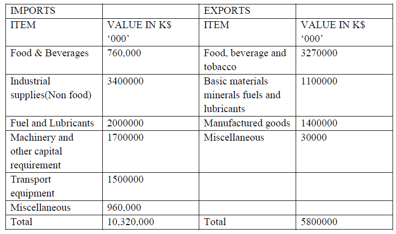 a) Use a radius of 5cm, draw a pie chart to represent data on exports shown on the table above. Show your calculations.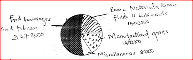 KCSE Geography Paper 2 2004 Section B Question 6. The table below shows four principal crops produced in Kenya in the years 2000 2001. Use it to answer question(a) and (b).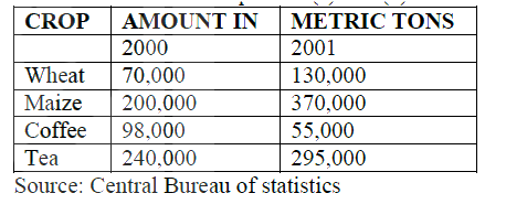 a) (i) Using a scale of 1 cm to represent 50,000 metric tons, draw a simple comparative bar graph based on the data above.(ii) State two advantages of using comparative bar graphs
b) Calculate the percentage increase in wheat production between the years 2000 and 2001.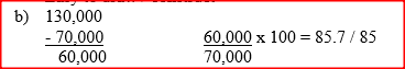 KCSE Geography Paper 2 2005 Section B Question 6. The table below shows the approximation of four districts in central province in 1999. Use it to answer question (a)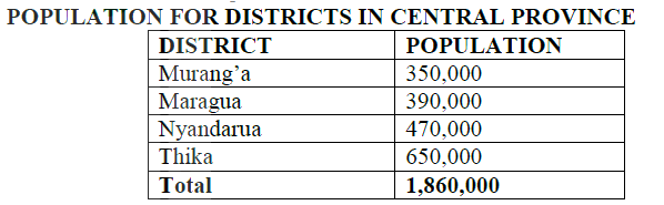 (a) (i) Suggest two possible reasons why the population of Thika is higher than that of Murang’a
(ii) Using a radius of 5 cm, draw a pie chart to represent the data above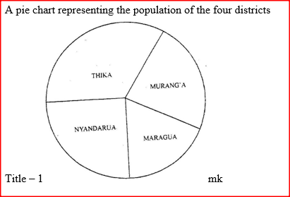 KCSE Geography Paper 2 1999 Section B Question 6 with Answers.The table below shows total number of livestock in Kenya in 1986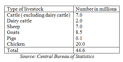
(a) Using a radius of 5cm, draw a pie chart to represent the information given in the table aboveKCSE Geography Paper 2 2006 Section B Question 6. The graph below shows percentage value of some export commodities from Kenya between 1999 and 2003. Use it to answer questions (a) and (b)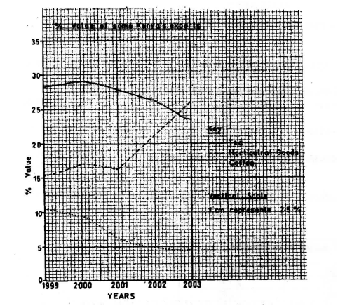 (a) (i) What was the percentage value of the tea exported in the year 2000?
(ii) What was the difference in the percentage values of the horticultural products and coffee exports in 1999?
KCSE Geography Paper 2 2009 Section B Question 6. The table below shows the number of tourists who visited Kenya from various parts of the world in 2005 and 2006. Use it to answer questions (a) and (b)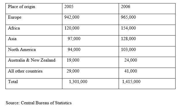 (a) (i) Which continent had the highest increase in the number of tourists visiting Kenya between 2005 and 2006?
(ii) Calculate the percentage increase of tourist from Australia & New Zealand between 2005 and 2006 KCSE Geography Paper 2 2013 Section B Question 6. The table below shows the approximate population size of four districts in Nairobi in the year 2009. Use it to answer question (a).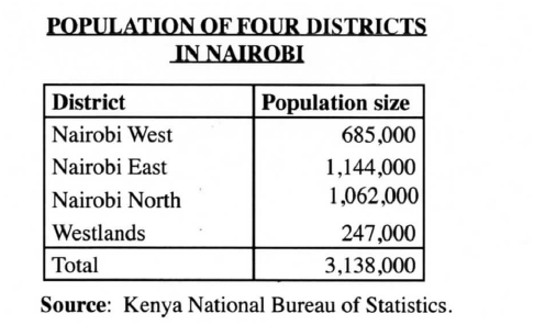 (a)(i)Apart from pie-chart, name two other statistical methods that can be used to represent the data in the table.
Using a radius of 5 cm, draw a pie chart to represent the data above. Show your calculations. KCSE Geography Paper 2 2015 Section B Question 6. The table below shows the value of some of Kenya’s mineral exports from 2008 to 2011. Use it to answer questions (a) and (b). (a) (i) Using a scale of 1 cm to represent 1 000 million Kenya Shillings, draw a comparative bar graph to represent the data shown. (ii) State three advantages of using comparative bar graphs to represent statistical data.
KCSE Geography Paper 2 2017 Section A Question 6. The table below shows the number of visitors in ‘000 to selected national parks in Kenya for the years 2006 to 2008. Use it to answer the questions that follow.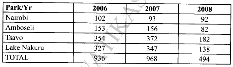 (a) (i) What is the difference in the number of visitors who visited the parks in 2006 and those in 2008.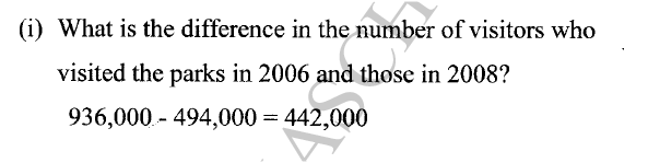 (ii) Calculate the percentage increase in the number of visitors who visited Lake Nakuru National Park between 2006 and 2007.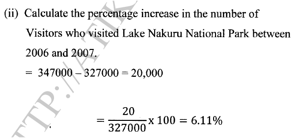 (b) (i) Draw a compound bar graph to represent the number of visitors to selected national parks in Kenya. Use the scale of 1 cm to represent 100,000 visitors.Compound Bar graph Representing visitors to selected National Parks in Kenya 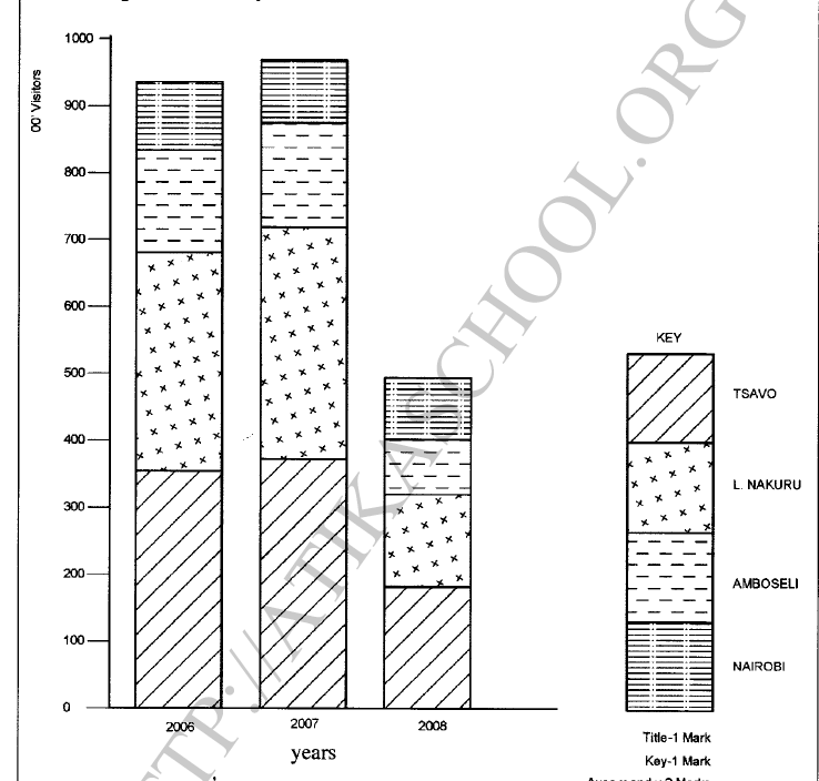 (ii) State three advantages of using compound represent geographical data.
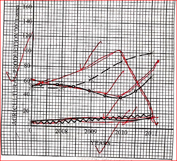
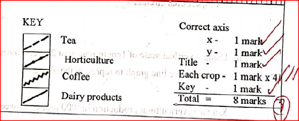
KCSE Geography Paper 2 2018 Section A Question 6. Study the data provided below and answer the questions that follow.Value of export earnings of selected crops from Kenya (Ksh millions)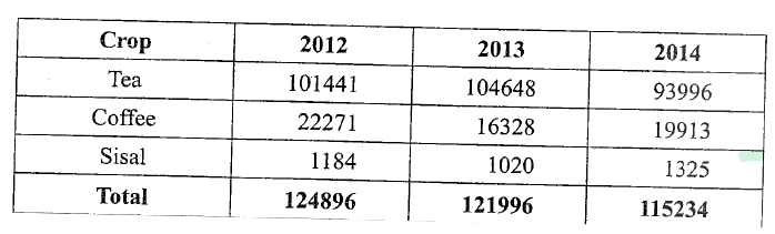 (a) (i)Using a scale of 1 cm to 50,000 million, draw proportional circles to represent the total export earnings between 2012 and 2014. Use the diameter method.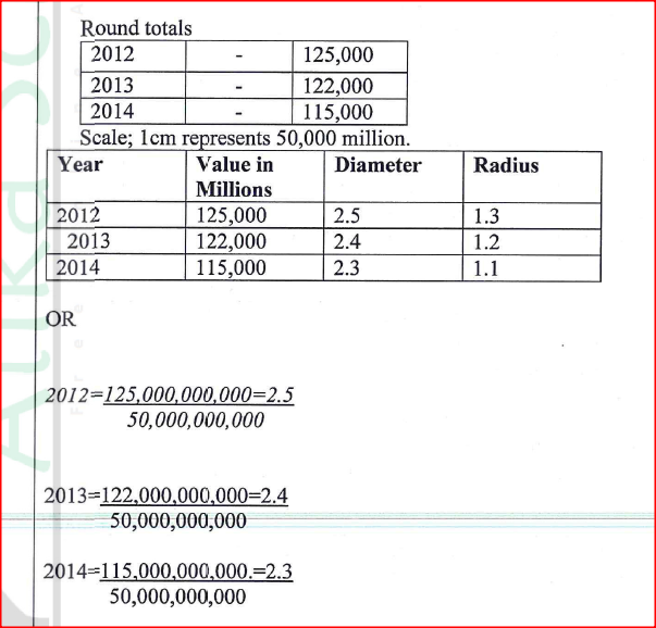 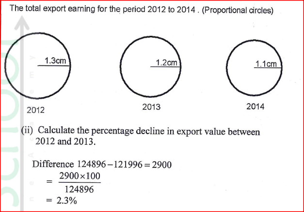 KCSE Geography Paper 2 2019 Section B Question 6. Use the table below to answer the following questions: Kenya's agricultural production in 1000 tonnes between 2008 and 2011.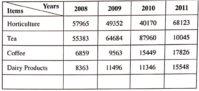 (a) (i) Apart from comparative Line graph, name four other methods that can be used to represent the above data.
(ii) Using a vertical scale of 1 cm to represent 20,000 tonnes, draw a comparative line graph to represent the above data. |
Archives
March 2024
Categories
All
|


 RSS Feed